| Should mobileTunes CSE have a mouse? |
| Yes |
|
32% |
[ 13 ] |
| No |
|
67% |
[ 27 ] |
|
| Total Votes : 40 |
|
KermMartian wrote:
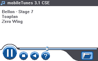
That looks really great, Caleb! I took the liberty of adapting the prototype that elfprince13 sketched and you greatly refined, shrinking the buttons, smoothing the edges between the white and gray, and adding a smaller version of the playback position marker I had previously created. What do you guys think?

I think it looks great Kerm!
I like it

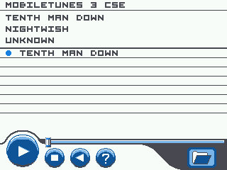
Thanks, guys! I'm working on chunking it up and adding it to mobileTunes 3 CSE now. Since CalebHansberry asked about how the division into individual sprites actually works, I figured I'd provide the image below. The pieces that are shaded in various colors are what I've pulled into sprites and added to the program, while I omitted everything not shaded. What I've done is try to determine the minimal set of image patches that I can use to reconstruct the whole image. For example, I've tried to eliminate big chunks of white, because filling the background with white will suffice to "display" those sections. Similarly, I have only selected an 8x8 area of the long playback bar, and I'll use a sprite display routine in a loop to copy it across the screen.
Edit: Using these chunks instead of the full image shrank mT3 CSE from 6.44KB to 5.29KB (before the code to draw out all the chunks).

I might suggest a visual representation of "clicked-ness" for the buttons, which would necessitate having masks to draw over only those pixels (I'm looking at open and pause buttons especially here, which currently overlap with over UI elements)
The play/pause button (the big one) changes between play (|>) and pause (||) depending on whether mobileTunes is playing or not. Is that what you had in mind? Or did you want the round button to look physically depressed while you hold F1 (Y=) down, and then return to normal when you release it?
KermMartian wrote:
Or did you want the round button to look physically depressed while you hold F1 (Y=) down, and then return to normal when you release it?
This one.
elfprince13 wrote:
KermMartian wrote:
Or did you want the round button to look physically depressed while you hold F1 (Y=) down, and then return to normal when you release it?
This one.
Don't want to go against an admin here but I personally don't think it's necessary, it's already changing from play to pause, however, I do think that doing it for all 4 buttons (Assuming it wouldn't be much more code to carry it out through all the buttons) would really make it look really nice and would definitely not be a burden at all.
mr womp womp wrote:
Don't want to go against an admin here
No matter which one you choose, you're going with one administrator and against one administrator. 
Quote:
but I personally don't think it's necessary, it's already changing from play to pause, however, I do think that doing it for all 4 buttons (Assuming it wouldn't be much more code to carry it out through all the buttons) would really make it look really nice and would definitely not be a burden at all.
I definitely agree that it should be an all-or-nothing addition: either all of the buttons should have the depressed effect, or none. Thanks for the opinion.
KermMartian wrote:
elfprince13 wrote:
KermMartian wrote:
Or did you want the round button to look physically depressed while you hold F1 (Y=) down, and then return to normal when you release it?
This one.
I think the extra polish would be worth it. I personally like fancy looking stuff 
It shouldn't be too hard to add that extra effect, and since it'll be the same on all of the buttons, I can re-use the same sprites for depressing the edges of each button. Thanks for the feedback, guys.
I definitely think it's an improvement! However, my brother advised me in his opinion that I was focusing too much on the lines between the colors, aliasing I think it was? I think somehow we need more random pixels in the buttons, but my brain doesn't think randomly or creatively, it thinks analytically and orderly, so I can't figure that one out.
I also think we ideally would reconcile two design themes present in this mockup: one says there are distinct borders around 2D objects in complementing colors, as in the folder button and as in most of DCSE, the other is trying to draw from Windows Media Player and MobileTunes and have a more dimensional look, with minimal borders, as in the buttons and slider marker.
It would fly as is for sure! Just trying to get closer to aesthetic perfection, in my own subjective view.
[EDIT] Ack, I got stuck on the last page of comments and didn't see all these new responses! The explanation of how the palettes work there is quite helpful to me. I would also vote that the visual feedback for pressing a button would be nice enough but not necessarily worth it.
CalebHansberry wrote:
I definitely think it's an improvement! However, my brother advised me in his opinion that I was focusing too much on the lines between the colors, aliasing I think it was? I think somehow we need more random pixels in the buttons, but my brain doesn't think randomly or creatively, it thinks analytically and orderly, so I can't figure that one out.
That's called dithering, and it might improve the buttons' appearance. However, I did a little bit of experimentation with dithering, and I'm worried it looks odd on a screen that can handle many colors.
Quote:
I also think we ideally would reconcile two design themes present in this mockup: one says there are distinct borders around 2D objects in complementing colors, as in the folder button and as in most of DCSE, the other is trying to draw from Windows Media Player and MobileTunes and have a more dimensional look, with minimal borders, as in the buttons and slider marker.
It would fly as is for sure! Just trying to get closer to aesthetic perfection, in my own subjective view.
No, you're right about that; it's inconsistent as-is. Actually, we need to figure out if the folder/open button is actually necessary, because mobileTunes 3 CSE doesn't use the Doors CSE open file dialog (because there is none). Instead, Mateo made it use iDetect to find songs.
Quote:
[EDIT] Ack, I got stuck on the last page of comments and didn't see all these new responses! The explanation of how the palettes work there is quite helpful to me. I would also vote that the visual feedback for pressing a button would be nice enough but not necessarily worth it.
Thanks, I appreciate that further opinion.
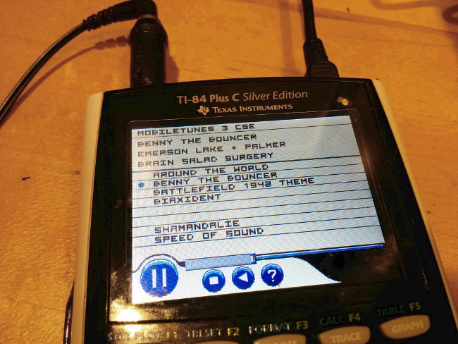
By the way, here's what mobileTunes 3 CSE currently looks like, with these new graphics added:

Nice work Kerm! Looks great!
Cool! My brother was astonished that you could get sound out of a calculator

.
Is there a colour limit for the graphics on screen?
tr1p1ea wrote:
Is there a colour limit for the graphics on screen?
Kerm + Mateo asked for a 2 bit palette.
elfprince13 wrote:
tr1p1ea wrote:
Is there a colour limit for the graphics on screen?
Kerm + Mateo asked for a 2 bit palette.- Make the slider get erased correctly by saving the data behind it from a buffer, or just drawing the known slider background back in.
- Store the slider's last position so the drawing can be skipped when possible.
- Solve problem with Y= triggering immediate quit when used to start a song
- Add dialog that actually pops up for the (?) button
- Add small icon to the left of "MOBILETUNES 3 CSE", identical to what elfprince/Caleb had.
- Make "titlebar" text white on gray?
- Space out buttons so they're closer to their keys
Anything else?

Nice!
Is it 2-bit palette per graphics element or as a whole? If the buttons are predominately 1 colour with some shade variations then perhaps there might be an option to change the colour ('theme')?
I was thinking a palette-switching theme option would be nice as well. I liked the "Cemetech Red" coloring I had earlier.
elfprince13 wrote:
I was thinking a palette-switching theme option would be nice as well. I liked the "Cemetech Red" coloring I had earlier.
Yeah, the ability to switch pallets would be pretty neat.
