| Which cover? |
| Cover 1 (blue-dressed female) |
|
9% |
[ 3 ] |
| Cover 2 (male) |
|
63% |
[ 21 ] |
| Cover 3 (tall-hat female) |
|
27% |
[ 9 ] |
|
| Total Votes : 33 |
|
Haha, graphmastur. DrDnar and Graphmastur, I agree, but again, they seem set on some variation of that version. Also, they're insisting on sentence case (Learn about the homescreen) instead of title case (Learn About the Homescreen) for chapter and section headings, which I find very odd, what do you guys think about that format?
graphmastur wrote:
I think Kerm's looks a lot better. Although, I suggest removing the "duplicate" word when you actually publish the book.

They actually plan to leave "Do not" on the cover while removing "duplicate." It's pretty odd 

KermMartian wrote:
merthsoft wrote:
I like theirs, though I'd prefer the graph to look better.
Indeed. My comments on theirs so far:
> There isn't supposed to be a horizontal line through the screen; that was just part of my Vitruvian Man stuff.
> Perhaps tone down the red/blue "3D" effect on the LCD?
> Better graph image; I'll give them my raw original screenshot
I think this pretty much sums up my impressions of their image.
Thanks, elfprince13. I'm still waiting to hear back from my contact that deals with the cover designers and other such people about the concerns I and the rest of you discussed in this thread.
*bump* Manning has gotten back to me with a final version. I see two problems that I still worry about:
:: The weird horizontal line is still on the calculator's case next to the LCD on both sides
:: I'd prefer a lighter yellow parchment.
Any thoughts (or disagreements on my points)?
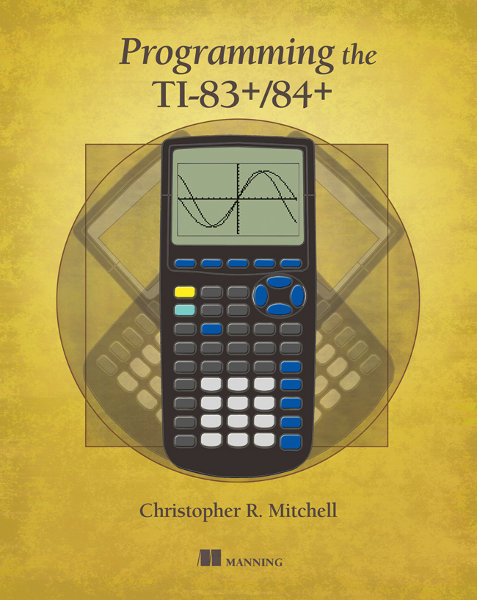
The horizontal line just looks like a lazy photoshop fail.. As for the color, I'd imagine it will look rather different when printed compared to how it looks on-screen, so it's a bit hard to say.
Agreed on all points. I'd also add that the coloured-in calculator looks rather half-arsed without the text labels to me - either keep it as a sketch (as you originally had) or fully detailed, not somewhere in the middle.
Tari wrote:
The horizontal line just looks like a lazy photoshop fail.. As for the color, I'd imagine it will look rather different when printed compared to how it looks on-screen, so it's a bit hard to say.
An excellent point. I included a pondering about exactly that based on your insight with my email, so thank you.
benryves wrote:
Agreed on all points. I'd also add that the coloured-in calculator looks rather half-arsed without the text labels to me - either keep it as a sketch (as you originally had) or fully detailed, not somewhere in the middle.
I completely agree with you, but I think they want something like this, not to mention avoiding certain copyright issues that might come up with a precise reproduction.
Please ask them to move the square down to the bottom of the circle, like in the original. It makes the reference far more clear!
Anonymous wrote:
Please ask them to move the square down to the bottom of the circle, like in the original. It makes the reference far more clear!
Care to elaborate? I'm not following what you're saying.
Anonymous wrote:
Please ask them to move the square down to the bottom of the circle, like in the original. It makes the reference far more clear!
Welcome to Cemetech! May I please ask you to sign in and introduce yourself? You won't be able to post again as a guest anyway; I accidentally forgot to set the permissions on this subforum properly.
comicIDIOT wrote:
Anonymous wrote:
Please ask them to move the square down to the bottom of the circle, like in the original. It makes the reference far more clear!
Care to elaborate? I'm not following what you're saying.
I must add, I know the square and the image you're referencing but I don't understand this "reference" to which you're implying.
The original Vitruvian Man sketch has the square aligned at the bottom of the circle, just like my original, and very much unlike the cover design that was eventually created from mine.
Ah, got it. I'm not familiar with the details of the original. Just some of them.
I can only assume the square is from his feet to his head, as the circle is from his feet to his hands, representing the two heights we have. I have no objection to either interoperation for the calc as the calculator is as tall as it can get.
As such, perhaps the square should be as tall as the circle?
Actually, looking at the picture above, the corners add height to it. So The square going to the top of the calc from the bottom is feasible.
Hmm, that makes sense. Actually, looking at it now, the square doesn't seem to match up to anything at all the way they have it.

The rotation was again eyeballed. These people shouldn't be doing Photoshop work.
Ya the right calculator is about 2 degrees too high...
The rotation may be correct, just not aligned properly. It appears to be a few pixels off.
The guest post above was me. I didn't realize that I wasn't logged in.
DrDnar wrote:
The guest post above was me. I didn't realize that I wasn't logged in.
No problem. ComicIDIOT figured it might indeed be you from the IP address. At any rate, I will dutifully voice my concerns, although I get the impression that the editor is pretty sick of hearing feedback on the design from me at this point. I think they would have been happier if I just picked one of those costume figures. 


: TI Runner-Up")


")