How about this:

I thought about it, the head was to light and the eyes were to dark, so I switched the levels. So its a dark-grey head, light grey eyes, black torso, and shoes/feet and dark grey pants
Angel, it looks good IMO, but how would you customize the sprite to indicate different types of people (if Kerm decided to do that), like a farmer, a warrior, a horseman, etc.?
The sprite only uses 7 columns, so the 8th could be used to show something like a crude sword or pitchfork. Maybe the Horses and people and be made seperately and then the extras piled on depending on the person. This is really Kerm's job unless he assigns or asks someone else to help with the actual sprite creation, I am just giving some really bad sprites that might be worth something eventually or maybe they are the entire set of sprites...
I was coming up with some beautiful grayscale ones of lumber jacks, miners, farmers, and spearmen. I'll get back to that.
http://img440.imageshack.us/img440/314/aoelf4.gif
Its a shame these 4 guys nearly take up the whole calc screen =(
HOLY SHIZZLES that is VERY good!
Macromedia fireworks layers ftw. get pic, minimize, draw over, delete original pic = good pixel art
Wow those are good sprites.
Pseudoprogrammer wrote:
Macromedia fireworks layers ftw. get pic, minimize, draw over, delete original pic = good pixel art
Or Photoshop layers, or GIMP layers, or... 
I r not t3h gimp mastur and do not have photoshop =(
I'm still not totally happy with anything. Angel has the right scale, but Pseudo's tracings just look too amazing for me to pass up. I'm going to try to scale down Pseudo's tracings while avoiding losing too much of the original information.
You could use mine in a close up menu where you selected what kind of person you wanted to make, or like in AOE3/mythology you can right click icons of people for a pic, and more historical info, if you wanted to make it that AOE based.
EDIT: Ill start working on a lot more scaled down sprites of random AOE things.
I like that idea. Most of the time on games like this, a really bad to semi-bad sprite is used to represent all the chracters of that single type. Then, when they are clicked on or chosen, the really detailed explantion of the chracter is put up. So like if the really bad designs were the shown ones on the mai game and the really good ones would be the informational sprites, I wouldn't mind, I just created mine to help out and in like 2 minutes... Anyways, Psuedo, good job, I really like them!
Im creating some 4 level grayscale semi-good-looking 20-25 px tall sprites atm. So far they look quite nice.
Well, CSII looks neat...I'm playing the first, and it's sloooooowwww...perfect example of sacrificing speed for graphics. (And a very poor tradeoff, I think)
Yeah the first is slow as cold molasses... And the graphics aren't all that great... But then again, you have to give it props for being one of the only BASIC isometric games out there.
Well, Hopefully because CSII will be in ASM, it will hav better speed and graphics, but then again, its all how the cards are played....
That reminds me I still haven't tryied the origonal, I got to do that.
*3.5 year epic necrobump*
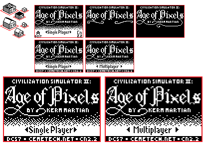
So, some random new titlescreen art and sprite design that I spent the last hour or two on. Comments?

Ohhh, this is the topic you necrobumped. I think the title screen looks great

The text is almost too hard to see, but you can pretty easily figure it out.
_player1537 wrote:
Ohhh, this is the topic you necrobumped. I think the title screen looks great

The text is almost too hard to see, but you can pretty easily figure it out.
No, the "By KermMartian" "DCS7" "Cemetech.net" parts.


