| Which cover? |
| Cover 1 (blue-dressed female) |
|
9% |
[ 3 ] |
| Cover 2 (male) |
|
63% |
[ 21 ] |
| Cover 3 (tall-hat female) |
|
27% |
[ 9 ] |
|
| Total Votes : 33 |
|
willrandship wrote:
My vote goes to the DaVinci.
Excellent, thanks for that.  I'm going to bump the email; I think it might have gotten lost somewhere down the chain.
Love the davinci design Kerm. Maybe you could have a line in binary saying "Buy this book" on the cover as a good luck charm.
krazylegodrummer56 wrote:
Love the davinci design Kerm. Maybe you could have a line in binary saying "Buy this book" on the cover as a good luck charm.
Hehe, that's very clever, I like it! Frustratingly, I still haven't heard the authoritative word on whether this cover can be used or not; I should probably send out feelers about it again.
Any news yet(on the covers) and what is the price going to be for the book so I can start saving up for it.
krazylegodrummer56 wrote:
Any news yet(on the covers) and what is the price going to be for the book so I can start saving up for it.
My permanent editor said that they sent it off to a designer to look at and offer some ideas; I'm wary about that, but we'll see. I believe they quoted me a sticker price in the $25-$35 range for the finished book. As far as progress, I have three full chapters written and am working on the fourth right now.
cool that sounds great cannot wait for it to come out
How many chapters are you hoping to reach?
Krazy: Thanks! As soon as we figure out the stuff with the cover, I'll have a public page about the book and will formally announce it here.
comicIDIOT wrote:
How many chapters are you hoping to reach?
My tentative Table of Contents has 14 chapters and four appendices.
*bump* It seems that Manning is asking around for reviewers. If you're my personal friend, I don't recommend you apply to review, since they prefer unbiased viewpoints, but if you have no bias, they posted an Omni topic:
http://ourl.ca/15047
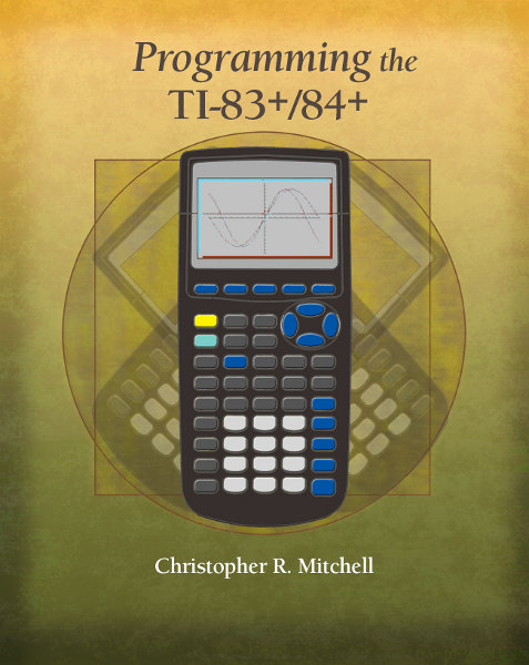
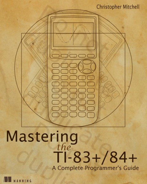
*bumpity bump* Cover concept at last! Manning wants to do the first image below, based on my original concept (second image). To be honest, I like mine better, but I get the impression that they're not really going to budge on this. Thoughts on the probable cover (top)?
Based on my original:
I like theirs, though I'd prefer the graph to look better.
merthsoft wrote:
I like theirs, though I'd prefer the graph to look better.
Indeed. My comments on theirs so far:
> There isn't supposed to be a horizontal line through the screen; that was just part of my Vitruvian Man stuff.
> Perhaps tone down the red/blue "3D" effect on the LCD?
> Better graph image; I'll give them my raw original screenshot
The graph screen looks pretty odd, especially with the red and blue lines and pixels. I like the rest, though.
JosJuice wrote:
The graph screen looks pretty odd, especially with the red and blue lines and pixels. I like the rest, though.
No arguments here. I've passed along the feedback you guys gave me that confirmed my own thoughts to the coordinating editor, and I'll let you guys know what she says.
Weregoose wrote:
Yellow/green? ...What?
Yes, dark yellow looks green. Didn't you already know this? 
I mean, I sincerely hope that's a 10-minute mockup. The cyan/red looks like a mistake from maxing out the contrast, the line overlays are an obvious goof, the calculator placements are now off—how hard is it to paste to the same location three times and use the same absolute value for positive and negative rotation?—the calculator lacks any sort of texture and lighting, and on top of all that, it now appears less like aged paper and more like it was peed upon. This work is entirely jejune; I would consider insisting that it be outsourced to an expert not on their Rolodex or payroll. I've seen some pretty a awful book covers – don't let yours turn into one of them!
Weregoose wrote:
I mean, I sincerely hope that's a 10-minute mockup. The cyan/red looks like a mistake from maxing out the contrast, the line overlays are an obvious goof, the calculator placements are now off—how hard is it to paste to the same location three times and use the same absolute value for positive and negative rotation?—the calculator lacks any sort of texture and lighting, and on top of all that, it now appears less like aged paper and more like it was peed upon. This work is entirely jejune; I would consider insisting that it be outsourced to an expert not on their Rolodex or payroll. I've seen some pretty a awful book covers – don't let yours turn into one of them!
Thanks, Weregoose. I have passed along your concerns as well as the query about whether this is a mockup or a proposed final design, although I toned it down a hair. I'll turn the tone up again if the questions you rightly posed aren't really answered.
I like Kerm's better. The illusion to the original Vitruvian Man is far more clear. I find it both humorous and fitting, considering the mathematical nature of the original.
Edit: You should totally fit the phrase "Vitruvian Calculutum"---or something like it---into the book somewhere.
I think Kerm's looks a lot better. Although, I suggest removing the "duplicate" word when you actually publish the book.

Register to Join the Conversation
Have your own thoughts to add to this or any other topic? Want to ask a question, offer a suggestion, share your own programs and projects, upload a file to the file archives, get help with calculator and computer programming, or simply chat with like-minded coders and tech and calculator enthusiasts via the site-wide AJAX SAX widget? Registration for a free Cemetech account only takes a minute.
»
Go to Registration page
You cannot post new topics in this forum
You cannot reply to topics in this forum
You cannot edit your posts in this forum
You cannot delete your posts in this forum
You cannot vote in polls in this forum


: 1st Place")


