This is an RTS I've been developing on and off for almost a year now. Inspired by Dune 2 and StarCraft, I aim for there to be some basic storytelling, harvesting and battle mechanics, among other things.

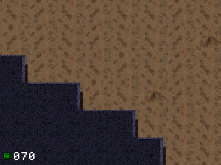
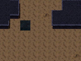
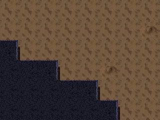
Below you see the main terrain rendering, the camera, and the ability to place down structures which progressively become more complete, mimicking the way the Protoss build.


Graphics are made with Blender and then exported through a custom script. Similarly, the map is also built with Tiled and goes through another exporter.

It's gonna be a long time before this reaches a playable state, but at least I have something to show. I've also put in far too much time to stop.
Cool stuff! I've always thought these kind of games lend themselves better to playability on calcs.
This is really cool!

What features are you working on next? Are you coding this in C?
Thanks.

Zaalane wrote:
I've always thought these kind of games lend themselves better to playability on calcs.

Yeah, the huge amount of buttons definitely goes in its favor, but the small screen means you'd have to explain the function of each button elsewhere. I intend to put an explanation on some print-friendly web page.

tr1p1ea wrote:
What features are you working on next? Are you coding this in C?

It's all ez80. Probably why it's taking this long, but it's quite fast.

As to features, the main building now builds infantries, and there is pathfinding (forgive the bad infantry sprite):


It's done via a nodegraph where nodes are rectangles. Upon pathfinding, the engine determines the start and end nodes, finds a path between them, then constructs a path of points for the entity to follow. This means entities can go through other entities, but I decided this was acceptable.

It's a bit wonky at the moment because the pathfinding doesn't take into account distance between nodes, and it always chooses the top-left corners of adjacencies between nodes. I intend to fix the latter, and call the former charming instead.

Next up is probably going to be harvesting and resource meters (and the dreadful text drawing that comes with it). Still deciding whether resources should be tiles or entities.
That's really cool and it runs very smoothly. I recall a discussion about RTS pathfinding many years ago and I always considered the node approach the best for calculators, so well done Smile.

What classes of units (inc vehicles) are you intending to have?
That's really cool. Are you thinking AI adversary or multiplayer?
Sorry for the late reply. I had actually done this a while ago, because I was burnt out on gameplay logic. Here's a briefing sequence. Is the text too small? I feel like it only looks too small on a big screen. On the real calc it's just about readable, and I hope to fit a lot in there.

Obviously the dialogue is to be spruced up, and there ought to be the participants faces.

Side-note: it appears this BBCode ignores links to WebP files. I'd suggest to get that checked out. I had to increase the resolution, which as a GIF had made it ten megabytes. With a WebP and its heavy compression I got it to 1.2.

ti1p1ea wrote:
What classes of units (inc vehicles) are you intending to have?
I really haven't thought of anything that far ahead. Apart from the infantry, probably a few more ground units, and an air one, which would ignore pathfinding. I also need to make sprites that actually turn 8 ways, and I fear how adding such core logic would affect the performance.

elfprince13 wrote:
That's really cool. Are you thinking AI adversary or multiplayer?
Only AI at the moment. Because it's story based, but more than that, it's because I don't have a second calculator to test it with. I can't imagine the kind of desync bugs there could be.
Looks good!, I like the image transition/fade, but I think the text may be too small? Would have to see it on calc and with the finished interface (even a mockup). A 3x5 font is going to be pretty small on a small 320x240 screen is all ... then again I'm no stranger to small fonts Smile.

Also CEmu can capture straight to APNG if you use that?
I agree that the text is probably too small. Nothing wrong with scrolling or splitting it into multiple screens if you have to to increase readability.

With that said, the background, stars, and transitions look excellent. Looking forward to more updates!
I had no idea support for APNGs was so widespread today, though it's still pretty ad-hoc compared to WebP.


Well, if not 3x5 then 4x6? I can go up to 8x since it's one byte per row.

As you see it's now a sliding transition. I needed some place to put mission objectives and tips before the actual game, but I may make it fade to black again. Don't know which I like more yet.

There are also now icons & markers. One represents your resources (notice how it drops by 50 once the unit is placed). The second appears when you select some unit, and shows its HP.

I intend for the player to occasionally return to the new unit (the Plant or Power Plant) to gain more resources. Come back too often and you lose some you could've gained later. Too little and the station begins to overflow, losing you resources again.

Another slight tick is that I haven't yet thought how the computer AI would work, and I'm inching ever closer to having to implement it. Its behaviour can't be predefined if you allow the player to meddle with the enemy base.
I like the sliding transition- it's very smooth and well-animated as presented in that screenshot. I also agree that the text is too small, but I like the font. Perhaps you could do 2x2 pixels of screen for every one pixel in the font?

Have you considered pseudorandomly rotating/mirroring the background tiles based on their position to add even more variation to the background (in addition to your existing variants for the base tile)?

This looks really well made so far; I'm excited to see what else you add to this in the coming months Smile
I've done both as you suggested. It does look better.


  • Mission briefings are now dialogues
  • Speaker icons are TBA (they should be animated)
  • Now it's a bouncing transition and looks like a screen popping up from below
  • Said screen has some sci-fi eye candy (will have more)
  • Added pseudorandom vertical mirroring to terrain as suggested by iPhoenix
  • Because lore-wise this takes place on an enemy planet, you will have planes sending squads instead of them randomly appearing
  • You're not supposed to control the plane, but I wanted to show the smarter, fixed pathfinding :)
  • Not shown, but the "plant" unit now grants you resources when you use it
  • Ignore the bad clipping..
Looks great and I agree the font is much more readable now.

Pathfinding is indeed nice and smooth too!
Christ, has it been six months? Sorry about that. I'm very busy with other projects and things, and sometimes I end up ignoring a few of them for whiles.

A few changes:
  • Entities can now move more than 1 unit per frame
  • Sprites are now clipped on the right and bottom sides
  • "Alert" text in case of info or user errors
  • You're finally disallowed from moving entities into the blue rocks, or selecting unselectable entities (eg. the plane)
On another note, having even two entities on screen halves the framerate, even though time taken between calls to my swap function is less than 800,000 cycles, according to CEmu. So I looked into it and noticed a peculiarity:

Code:
GRSwap:
   ld HL, (mpLcdLpbase)
   ld DE, (mpLcdUpbase)
   ld (mpLcdLpbase), DE
   ld (mpLcdUpbase), HL
GRSync:
   ld HL, mpLcdIcr
   set 2, (HL)
   ld L, mpLcdRis & $FF
_:
   bit 2, (HL)
   jr Z, -_
   ret

For what reason is clearing the interrupt flag done first, and not waiting? If the flag works the way I think it does, would this not waste an entire frame's worth of time, if the flag is set before rendering completes? I switched it to the following:

Code:
GRSwap:
   ld HL, mpLcdRis
_:
   bit 2, (HL)
   jr Z, -_
   ld HL, (mpLcdLpbase)
   ld DE, (mpLcdUpbase)
   ld (mpLcdLpbase), DE
   ld (mpLcdUpbase), HL
   ld L, mpLcdIcr & $FF
   set 2, (HL)
   ret

Now I'm clearly missing something, because this causes tearing, as seen above. OTOH the framerate is now heavily boosted.

Whatever the case may be, I'm ready to call it a feature.
The second method is more correct than the first, the tearing is simply because of the way the graphics are set up by the OS to account for the fact that the screen in the calculator is sideways (its actually a 240x320 display, not a 320x240 display). There are ways around that, the simplest being to change the setup so each line is vertical rather than horizontal.

Glad to see this making a comeback Smile
I'm very excited to see more updates!
  
Register to Join the Conversation
Have your own thoughts to add to this or any other topic? Want to ask a question, offer a suggestion, share your own programs and projects, upload a file to the file archives, get help with calculator and computer programming, or simply chat with like-minded coders and tech and calculator enthusiasts via the site-wide AJAX SAX widget? Registration for a free Cemetech account only takes a minute.

» Go to Registration page
Page 1 of 1
» All times are UTC - 5 Hours
 
You cannot post new topics in this forum
You cannot reply to topics in this forum
You cannot edit your posts in this forum
You cannot delete your posts in this forum
You cannot vote in polls in this forum


Advertisement