We all love it here at Cemetech, sharing ideas and thoughts, and making new things with our knowledge of TI software and hardware. We have created over 5000 programs and games as a community, and continue to improve upon them as friends and comrades. Led by our Founding Father Kerm, we have gone forward by leaps and bounds, and all in the blink of an eye. But what if we could make it even better? A new calculator to explore would be nice, but what if we went further?
Post your ideas and drafts (or even complete products) for a new Cemetech logo below, and if it an idea or draft looks good, I'll use my Adobe Photoshop skills to create it to the best of my ability. The winners will be presented in August.
Have fun!
Not a submission, but I put together a mini-banner for a topic I made a while back.
Cemetech of the Future.
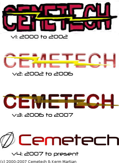
I'd like to let anyone know, who wishes to participate in this, that this Contest held by CalcMeister is not an official one. If you're interested in the evolution of our Logo, and what never came to be, check out
this topic.
For the click-lazy, here's the image from that topic:
Meanwhile, feel free to participate!
Where is the current level go? The one on the banner on the top of the site?
Also, I like the 2006 logo the best

I don't see what's wrong with the current logo but I do like that last unused logo in the picture above.
Rephrase: Why isn't the banner at the top of the site in that list?
Unicorn wrote:
Rephrase: Why isn't the banner at the top of the site in that list?
Cause its an ancient post from back when I was 9. (i'm 17 now)
Now I'm really confused. So mr womp womp made the current Cemetech banner ?
Unicorn wrote:
Now I'm really confused. So mr womp womp made the current Cemetech banner ?
no, all I meant is that the picture with all the banners is really old, I didnt make any of them.
Oh... Then why isn't the "most recent" one used? (KermM?)
Unicorn wrote:
Oh... Then why isn't the "most recent" one used? (KermM?)
Because that picture was created before the current one was made.
Perhaps they are saving it for the next whole banner they make? or maybe possibly a new cemetech theme? actually, I hope not, I like the site as it looks.
anyways, you guys should continue this in another thread, cause this thread isnt for the "history of the banner".
Luxen wrote:
Perhaps they are saving it for the next whole banner they make? or maybe possibly a new cemetech theme? actually, I hope not, I like the site as it looks.
That's exactly what it was.
Quote:
anyways, you guys should continue this in another thread, cause this thread isnt for the "history of the banner".
Seconded. If you guys care to partake in this contest, by all means. But let's not go on a tangent. That's not at all what I intended to do. You are welcome to create a second topic to discuss these things as Luxen mentioned but let's get this topic back on track.
Yeah, I just wanted to get that straight. On with the contest!

What this site really needs is to have the folks in charge of the mobile theme make it fully responsive.
There are two distinct themes I notice within the drafts I have inspected so far. The first is the classic red CEMETECH with a lightning bolt through it, of which there are many variations. The other interesting theme to consider is that of comicIDIOT's earlier post, featuring an interesting gyroscope-like logo adjacent to the word "Cemetech". What catches the eye is the classic Naval Base font which speaks to the intensity and exuberant sociability of this community. however, I don't think we're ready to lose the lightning bolt.
Keep it up!
I'm getting a 403 error. Can you try uploading to imgur or another image host?
The end is here! We have a winner to this unofficial competition! (Yes I know ComicIdiot.) To see it, please go to this link:
http://cemetechlogo.weebly.com/uploads/4/2/1/7/42176055/631839_orig.png
If it is not too late... I would suggest some contrast, something totally eye-catching... I would add a few more shades of blue and smoothly graduate it to white/light grey, while keeping the shapes like they are.


: 1st Place")
