| Which menu do you like the most? |
| Home Screen - Cursor |
|
0% |
[ 0 ] |
| Graph Screen - No Cursor / Push Button To Navigate |
|
10% |
[ 1 ] |
| Graph Screen - Cursor |
|
90% |
[ 9 ] |
|
| Total Votes : 10 |
|
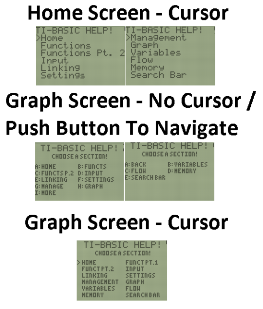
Sorry, but here is the updated version. I have made it so that you have three options (the third was suggested by someone else). Here is the updated picture:

I think people like the third version a lot more because it can have different text sizes, fit more options, and it is a very good visual for what you are selection when you have a cursor. It looks very nice with two columns instead of one column at a time with the homescreen option.
readroof2 wrote:
I think people like the third version a lot more because it can have different text sizes, fit more options, and it is a very good visual for what you are selection when you have a cursor. It looks very nice with two columns instead of one column at a time with the homescreen option.
I agree, that is why that menu will be the menu that I use for all of the different menus, both at the title screen and for the different categories
Register to Join the Conversation
Have your own thoughts to add to this or any other topic? Want to ask a question, offer a suggestion, share your own programs and projects, upload a file to the file archives, get help with calculator and computer programming, or simply chat with like-minded coders and tech and calculator enthusiasts via the site-wide AJAX SAX widget? Registration for a free Cemetech account only takes a minute.
»
Go to Registration page
You cannot post new topics in this forum
You cannot reply to topics in this forum
You cannot edit your posts in this forum
You cannot delete your posts in this forum
You cannot vote in polls in this forum

