

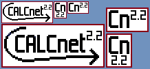
I drew these up today to go in the upcoming (eventually) whitepaper / tutorial for using CALCnet 2.2 in your own programs. Compare to the CALCnet and CALCnet 2 logos:


: Participant")


: 1st Place")

The lines on the color ones (the first two) on the arrow look a little jagged, is there a way to smooth those out?

- 16 Sep 2010 03:42:40 pm
- Last edited by KermMartian on 16 Sep 2010 03:44:00 pm; edited 1 time in total
qazz42 wrote:
cool, lookin fine!
Sweet. Edit: @Merth: part of that is a Moiré effect because you're viewing partial transparency on a non-white background. I'll try to mitigate that better, though.

I like the CN2 logo better. I don't think a minor version change (albeit a big change?) doesn't warrant a logo revision.

There are two types of people in the world: those who can extrapolate data from incomplete data
comicIDIOT wrote:
I like the CN2 logo better. I don't think a minor version change (albeit a big change?) doesn't warrant a logo revision.
Yeah, but it's four years later, plus it works oncalc has has broadcasting now, and I love designing logos. KermMartian wrote:
I can try to build features of the 2.0 logo into the 2.2 logo if people want.
Please!
There are two types of people in the world: those who can extrapolate data from incomplete data
comicIDIOT wrote:
KermMartian wrote:
I can try to build features of the 2.0 logo into the 2.2 logo if people want.
Please!


The logos are all pretty. IMO, the one that Comic Idiot and everybody is voting for is the best. If your still drawing them, try making one in calculator resolution. I want to see what that would look like 

I actually like the new logo 2.2 logo more but it could use some AA or something to make it look less jagged.

"Always code as if the person who will maintain your code is a maniac serial killer that knows where you live" -Unknown
"If you've done something right no one will know that you've done anything at all" -Futurama
"Have a nice day, or not, the choice is yours." Tom Steiner
<Michael_V> or create a Borg collective and call it The 83+
<Michael_V> Lower your slide cases and prepare to be silent linked. Memory clears are futile.
KermMartian wrote:
comicIDIOT wrote:
KermMartian wrote:
I can try to build features of the 2.0 logo into the 2.2 logo if people want.
Please!
There are two types of people in the world: those who can extrapolate data from incomplete data
Aight, I hear that; that's helpful feedback, and definitely something that I can work on. I'll try some prototype logos based on those suggestions tomorrow and post them up for you guys to critique.

Register to Join the Conversation
You cannot post new topics in this forum
You cannot reply to topics in this forum
You cannot edit your posts in this forum
You cannot delete your posts in this forum
You cannot vote in polls in this forum
You cannot reply to topics in this forum
You cannot edit your posts in this forum
You cannot delete your posts in this forum
You cannot vote in polls in this forum
Advertisement